The written word is very important. We use it in everyday life to communicate with family, peers and the world in general, be it leaving a quick handwritten note on the fridge as a reminder or sending an email to give an update on a project. Similar to how writing is used to share messages, reading is inherently needed to understand writing.

Words are everywhere. They are in the written materials, whether notes or textbooks, that we share with our students, they form the captions and subtitles of videos, they are in the assignments and tests. We use words in presentations while teaching and further encourage students to use words in their presentations. I have made my point, I am sure. 🙂
Though I will talk exclusively about teaching materials for English, you can replace ‘English’ with a similar language of instruction used by you.
Immigrants and international student populations in Canada
A colleague of mine recently attended a seminar about bringing inclusion in the university classroom. While he has been expecting a presentation on inclusive language, removing gender stereotypes, working with students who have learning disabilities, he was surprised when the presenter elaborated on readability and legibility of material instead.
While designing materials for the courses, especially at university level, we often think about the ‘students’, however, we forget that many in this student body are from overseas who learned English as a second or third language. According to Statistics Canada (2016), international students, who moved to Canada from another country for the purpose of pursuing education, constituted roughly 11% of the students in all university programs in 2013–2014. This international student population has seen a rise of 88% between 2004–2005 and 2013–2014. Though latest statistics are not available, I am sure the current percentage is higher than before. We often assume that international students might have difficulty understanding native speakers but we hardly think about the difficulty reading printed material might have for them.
According to the Canadian Educators Statistics Council, “Because of the high number of immigrants making Canada their home in the last decades, the students attending many urban Canadian schools come from diverse cultures and speak the language(s) of those cultures. Other students live in minority-language environments” (2009, p. 10). Thus, if we look at the school level instead of the university, the number of students for whom English is a second language is higher as many students are children of immigrants from Asia and Middle East. Schools provide extra support for every student who is identified as an ESL (English as Second Language) learner for them in succeed in education and be at home in Canada.
Readability and Legibility
Readability and legibility are concepts from the field of typology — fonts for the layman. Farley (2010) defines the two terms are follows:
Readability is how easy it is to read words, phrases, blocks of copy such as a book, a web page or an article.
Legibility is a measure of how easy it is to distinguish one letter from another in a particular typeface.
It is important to choose fonts that do not wear the readers out. Since most written material is for consumption of more than one person, it makes sense to look at how to present material to not just native speakers or international students at universities but also children who are starting to learn a language as well as those who have reading difficulties such that everyone can easily read the language of instruction — English in this case.
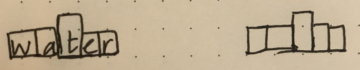
Word shape: Boumas
The concept of chunking comes from cognitive psychology and is defined as the process of creating symbols or chunks that represent the combination of several other symbols. Chunking allows information to be stored in memory in a special way to allow for goal-based performance (Miller, 1956). In case of words, for example, we could store the shape of the words as chunks to allow for faster reading.
Within the field of typography, a particular theory of word recognition is called Boumas — recognizing words by their shape — and it says that we read this shape or outline of the work if we are familiar with the word (Herrmann, 2011). Thus, words are recognized as complete units rather than individual letters. There are two further claims regarding boumas: it can be seen as the pattern of ascending, descending or neutral words, or as an envelop around the whole word (Larson, 2004).
Larson (2004) presents four experimental cases that support boumas. The strongest supporters are:
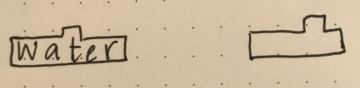
- Once someone becomes familiar with the shape of a word, they can fill in missing letters.
- Lowercase texts enable unique patterns of ascending and descending and neutral characters, allowing for more readability and legibility as compared to all upper case letters.
- It is difficult to read text in alternating case. For eXamPle, I am sure you were fInDIng this a little hard to read.
A more recent support for boumas has come from a research at Georgetown University where researchers found that the brain learns words quickly by tuning neurons to respond to a complete word, not parts of it (Georgetown University Media Center, 2015). Words are remembered in the form of a visual dictionary, where the visual word form is about how the letters of the word look together — boumas. The study also provides insights into how people who struggle with phonetically spelling out words can learn words.
For the words we see on paper or on a digital screen, the neural representation for written words is known as orthographic lexicon. According to the Dual-route model for reading (Coltheart et al., 2001), it is this orthographic lexicon(visual) of the word that activates the word’s name in the Phonological Lexicon (pronunciation), before activating the word’s meaning in the Semantic Lexicon (meaning). For example, consider the word ‘orthographic’: after identifying the word, the brain searches for its right pronunciation using phonics. Once the word and the pronunciation are clear, the brain searches for the meaning and if it knows what the word is, it gives us the meaning, making sense of the word in the sentence. That’s how dictionaries organize their words. They have the word written first in a specific font, followed by the phonic representation of the word, followed by its meaning.
Possible Guidelines for Designing Teaching Material
The following are tips that I have accumulated after searching through many online resources. Please feel free to suggest more good practices! (Thanks to Varun Bhargava for adding to this list.)
- The write up we come across in newspapers, magazines, textbooks, advertisement billboard, use different font sizes to differentiate between the headings and the body of the text. Thus, we need to use mixed case fonts in teaching materials as well as they are a part of most of the reading content that students would read outside of class. This would also help them gather more information from the reading material, be able to quickly identify headings and subheadings, for example.
- For Headlines and Titles, Upper Case Letters are recommended as they help to clearly differentiate each word and letter from the others. Thus, if a student even barely remembers anything s/he would still remember the headline or title.
- While designing the material, reading shapes can be used in such a way that similar shapes are kept away from each other in order to not confuse the reader. According to Larson (2004), an earlier research found that it was harder to identify misspelled words if they had the same shape as the original word.
- In higher grades, it might be helpful to cater the typeface according to the speed at which the students read, thus differentiating the content by student readiness (refer to my article Making learning meaningful and accessible).
a. Calibri and Helvetica are good for students who have difficulty in reading. Bookman Old style is good for those who read faster. Of course, these are just examples from the plethora of fonts that we have available to us today.
b. Using Sans Serif fonts is recommended for students with reading difficulties as the letters are more distinct. For readers who are faster, Serif fonts can be used as they fill the reading area more giving the reader a sense of gaining more. - Medium is another important consideration. Farley (2010) suggests the following for paper and digital:
a. On paper, Serif fonts are generally the most readable as they help lead the eye from one character to the next. Most newspapers and books are set using serif fonts for the body.
b. For digital access on a screen, Sans-Serif fonts (such as Arial, Verdana) are considered to be more readable.
These guidelines are very general and not just applicable to teaching materials. Be it for webpages, advertisements or writing, these guidelines can be used to make the readers’ experience a smooth one, allowing both native and non-native readers to read seamlessly. Also, many companies have guidelines for presenting text. Apple’s Human Interface guidelines for iOS apps can be found here.
Conclusion
My brother is in Grade 3 and is a native English speaker. After learning about boumas, I was going through his writing toolkit workbook that his teacher had put together to learn new words. I could identify at least 3 different fonts, none of which are Sans Serif. When I have thought of elementary school before, I always imagine being able to use funky fonts to make reading more fun. However, in those early years, when children are just learning to read, the use of funky fonts, might not be a good idea, as it could hinder the readability and legibility of the text. Another important consideration is that we don’t come across funky typefaces in everyday life. Hence, the best practice in my opinion, would be to use fonts similar to those we see in everyday life.
As Harshita Arora explains in her article How Typography Determines Readability: Serif vs. Sans Serif, and How To Combine Fonts, fonts emanate a mood as well, hence, being aware of which ones we use, the ease of readability and legibility as well as the mood — all play a role into the experience the user has, the student in our particular case, with the content. Now that I have discovered the best practices in fonts and developing written materials, whether print or digital, I had better follow them, even on Medium! 🙂
Coming up:
Larson (2004) presents a counter argument to boumas and analyzes literature on word recognition using the parallel word recognition model in which “the letters within a word are recognized simultaneously, and the letter information is used to recognize the words”. I do not think this relates to typography per se because letters are recognized for their individuality rather than the word as a whole as in case of boumas. However, this preliminary observation might be incorrect and I hope to look at this in depth in the future.
If you have any similar ideas or techniques that you use in the classroom, tweet to @a_teachers_hat on Twitter.
References:
Arora, H. (2018, January 16). How Typography Determines Readability: Serif vs. Sans Serif, and How To Combine Fonts. freeCodeCamp. Retrieved from https://medium.freecodecamp.org/how-typography-determines-readability-serif-vs-sans-serif-and-how-to-combine-fonts-629a51ad8cce
Canadian Educators Statistics Council (2009). Key Factors to Support Literacy Success in School-Aged Populations. Retrieved from http://www.cmec.ca/publications/lists/publications/attachments/201/key-factors-literacy-school-aged.pdf
Coltheart, M., Rastle, K., Perry, C., Langdon, R., & Ziegler, J. (2001). DRC: a dual route cascaded model of visual word recognition and reading aloud. Psychological review, 108(1), 204–256.
Farley J. (2010, January 24). Typography: Readability and legibility (part 1). Retrieved from https://www.sitepoint.com/typography-readability-and-legibility-part-1/
Georgetown University Media Center (2015, March 24). After learning new words, brain sees them as pictures. Retrieved from https://gumc.georgetown.edu/news/After-Learning-New-Words-Brain-Sees-Them-as-Pictures
Herrmann, R. (2011, June 13). How do we read words and how should we set them? Retrieved from https://typography.guru/journal/how-do-we-read-words-and-how-should-we-set-them-r19/
Larson, K. (2004). The science of word recognition. Advanced Reading Technology, Microsoft Corporation. Retrieved from https://docs.microsoft.com/en-us/typography/develop/word-recognition
Miller, G. A. (1956). The magic number seven plus or minus two: Some limits on our capacity for processing information, Psychological Review, 63, 81–97.
Statistics Canada (2016, October 20). International students in Canadian Universities, 2004–2005 to 2013–2014. Retrieved from http://www.statcan.gc.ca/pub/81-599-x/81-599-x2016011-eng.htm.
Be First to Comment